COMPANY Introduction
Harmony
The HITEJINRO font is designed to promote the spirit of filling the world with more excitement and energy with the merging of Hite and Jinro. We would like to introduce the HITEJINRO font “Harmony,” which was developed to establish its own identity in harmony with the HITEJINRO English Logo while enhancing the brand reputation.
Designed based on the HITEJINRO English Logo, the HITEJINRO font “Harmony” symbolizes the dynamic and passionate spirit of the company. The visual flow is at the top to make it easier to see while the horizontal letters create a sense of rhythmic feeling with the space at the bottom.

Characteristics of English Letters
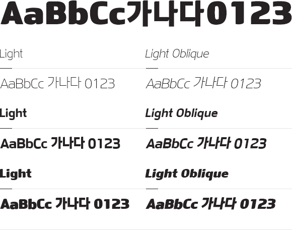
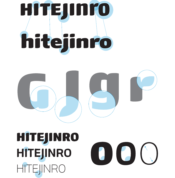
Both alphabet letters and numbers are designed based on Sans Serif in Light, Medium, and Black. The characteristics of the letters symbolize dynamic movement while harmonizing with Korean characters. The uppercase letter “J” and lowercase letters “j” and “r” expresses HITEJINRO’s brand identity. Certain strokes are simplified in the Light font to maximize their use.

Characteristics of Korean characters
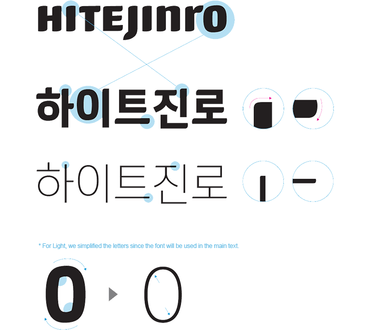
The Korean font is designed to express the dynamic movement of the protruding parts of the vertical and horizontal lines to make the text more readable and create a sense of stability. The letter “0” in Medium emphasizes dynamism while the Light font is simplified in consideration of its use.

The HITEJINRO font is available to download and use by anyone.
(However, using the font for commercial purposes is strictly prohibited.)

